WORD Magazine
WORD Magazine is a free publication for UCSB students by UCSB students about daily life in the neighboring college town, Isla Vista, CA. In the space, one would be assigned either writer or artist based on interest. Artists, or designers, such as myself would collaborate with writers to deliver their message in the most aesthetic and sensible way, all with the reader’s experience in mind.
YEAR
May 2022 - December 2022
TOOLS
Adobe Photoshop - Adobe Illustrator - Adobe InDesign - Procreate - stud.io
SERVICES
Spread Design - Story Identity - Art Direction - Photography - Illustration - Typography
“LEGO DIE TABLE”
WORD MAGAZINE, Issue 48, Winter ‘22, pp. 48-49
This is a two-page spread artist feature I designed for the 48th Issue of WORD Magazine. It depicts the creation of a wooden table made by college students for drinking games as an instructional LEGO manual. I utilized a LEGO manual creator known as stud.io, as well as Illustrator and Procreate to create the visuals..
Word Magazine being a publication for UCSB college students by UCSB college students, I thought the idea of a LEGO die table would be fitting and amusing for the targeted college student readers. I followed many example manuals, as well as learn a new program to get as close of a replication as I could get. As simple of an idea as it is, the design went through many iterations, and a lot of communication occurred between the editors and I to execute the idea well.
INSPIRATION AND PROCESS

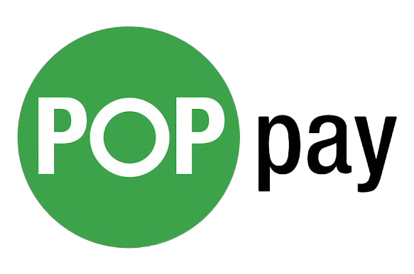
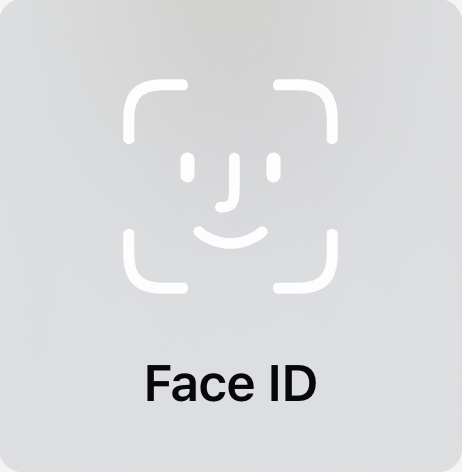
“YOU WANT ME TO PAY WITH MY FACE?”
WORD MAGAZINE, Issue 48, Winter ‘22, pp. 42-43

“You Want Me To Pay With My Face?” is an article I designed through assignment with writer Joshua Rubow. I explored themes and colors for the spread that would fit with the story concepts and author’s views.
Pop Pay is an independent company based out of Isla Vista, CA. Their goals are to transform transactions from card tapping to Face ID. Keeping this in mind, I ran with a “face card” theme along with a green and white color palette to match the company logo. This doodle style fit with the story as it commented on the company’s simple and kind of silly concept.
INSPIRATION AND PROCESS

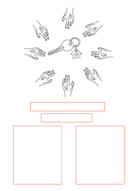
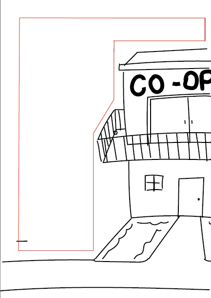
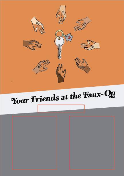
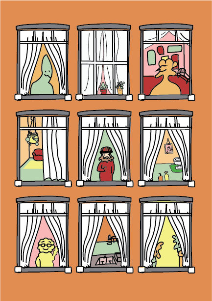
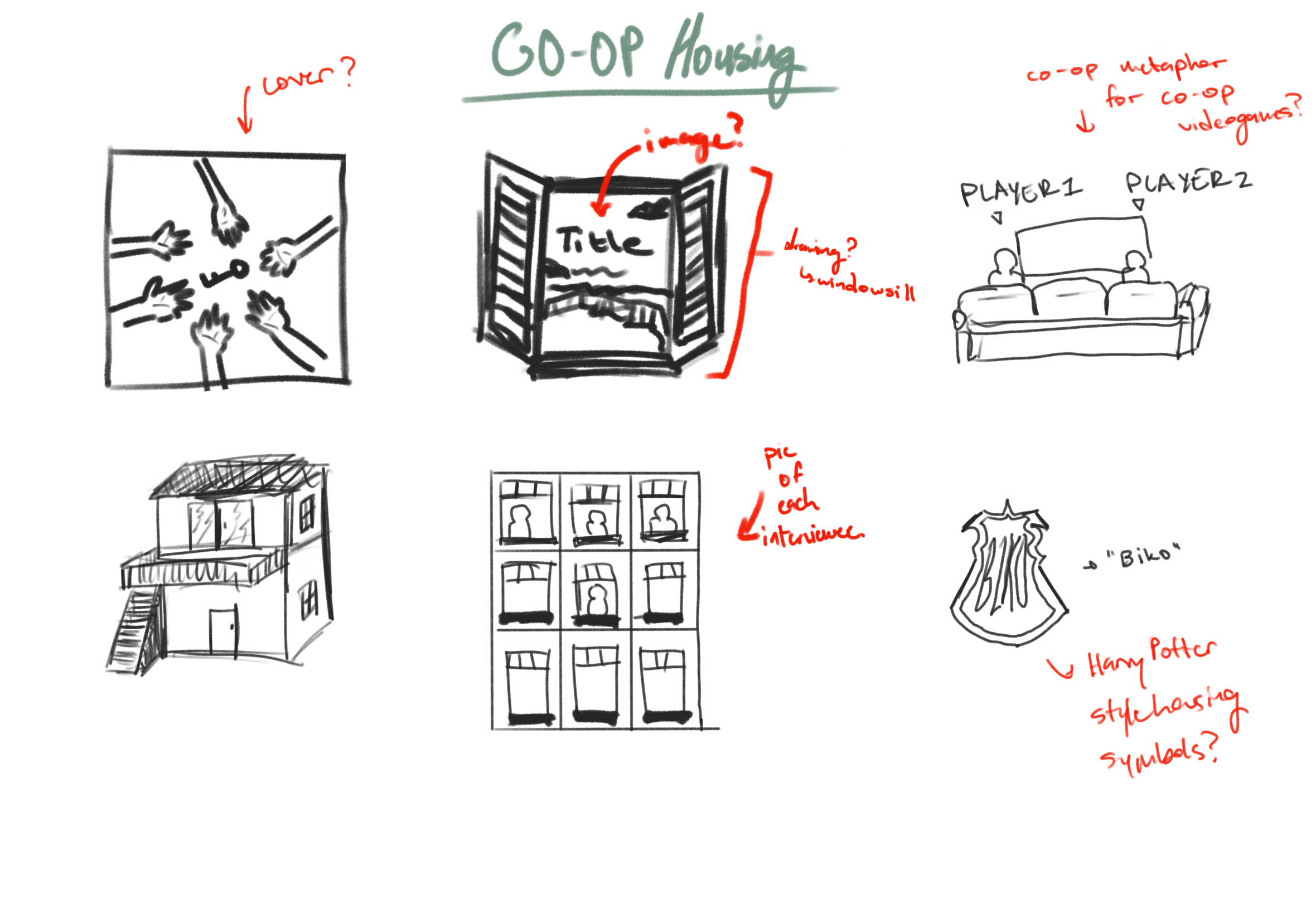
“YOUR FRIENDS AT THE FAUX OP”
WORD MAGAZINE, Issue 47, FALL ‘22, pp. 31-34
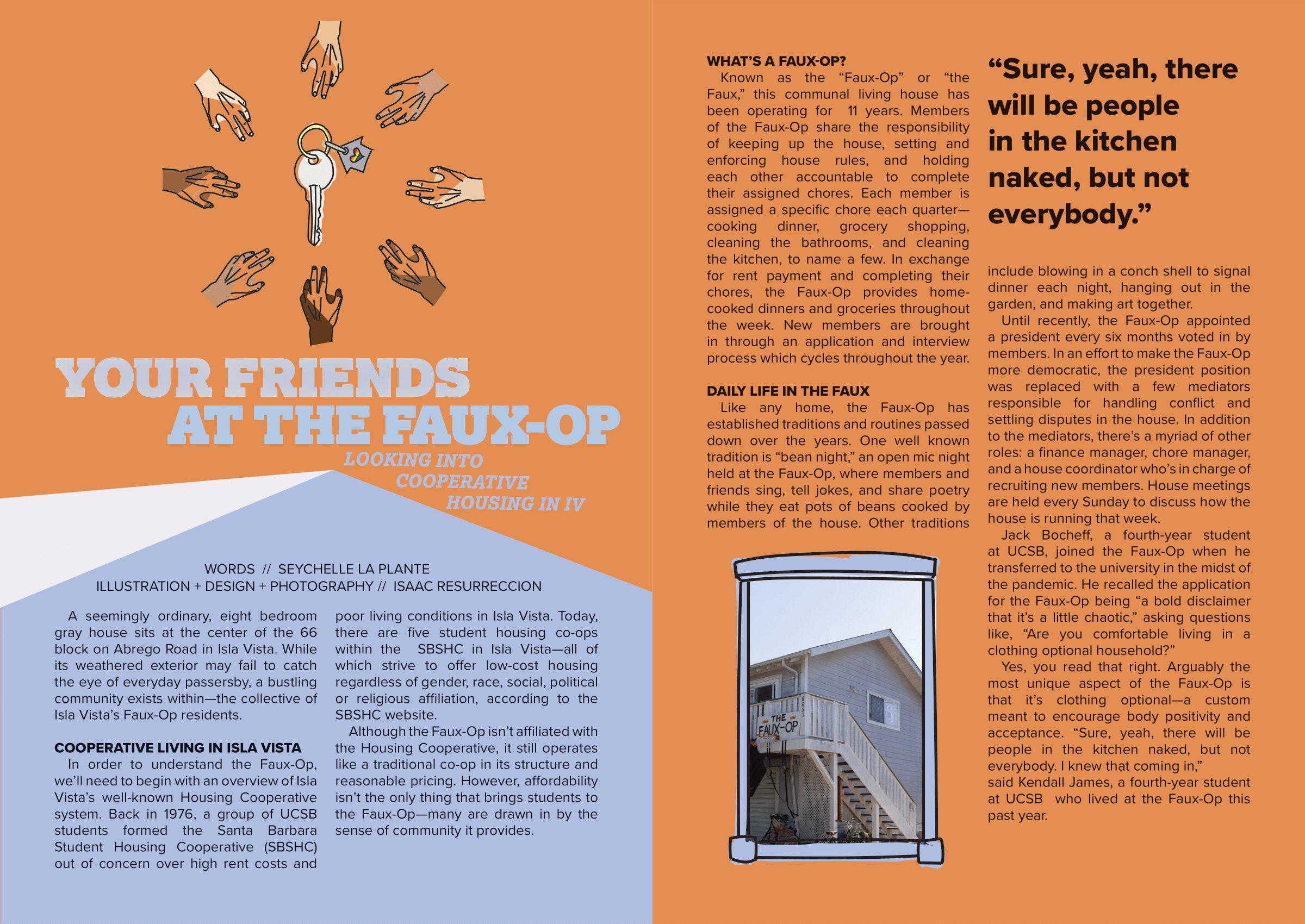
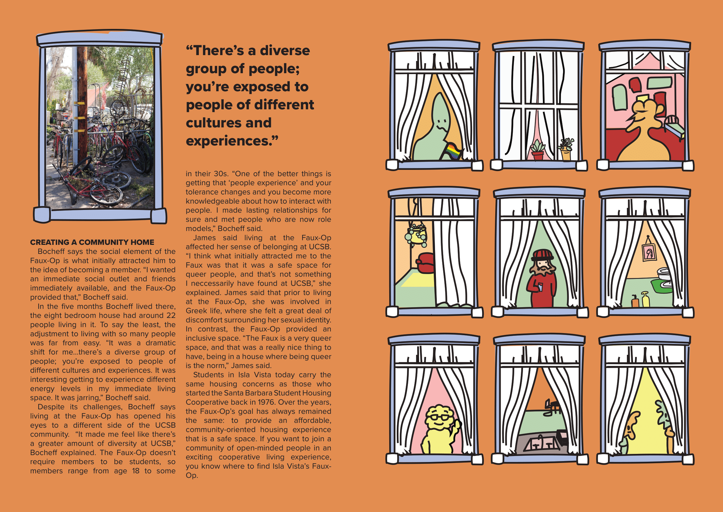
“Your Friends At the Faux-Op” is an article where I teamed up with writer Seychelle La Plante to create this four-page spread. This being my first assignment with WORD Magazine, I came in with an open mind and broad direction.
Being a story with a lot of copy, I had to make a lot of sacrifices in terms of the design. I came up with multiple layouts to fit the copy in, and maintain a certain aesthetic. I dedicated a whole page to just visuals so that the spread varied for the reader’s pleasure. I utilized the housing elements within the story to create a “structure-inspired” layout for the article. For example, the windows of a house being framing for images of the Co-op helped add a specific aesthetic.
INSPIRATION AND PROCESS